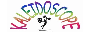
Kaleidoscope Theatre Group wanted to update their logo but still keep the essence of what had been a much loved original version.

I updated the font to reflect current trends, and widened the colour palette, using a gradient wash across each individual character, whilst retaining the rainbow theme.

Redrawing the theatre icon, I chose to incorporate two smiling faces; this embodies Kaleidoscope's ethos of inclusivity and warmth.

This logo radiates positivity and acceptance, symbolising a community that embraces diversity and welcomes everyone with open arms.