Creation of a new branding kit for Peak Adventure, including:

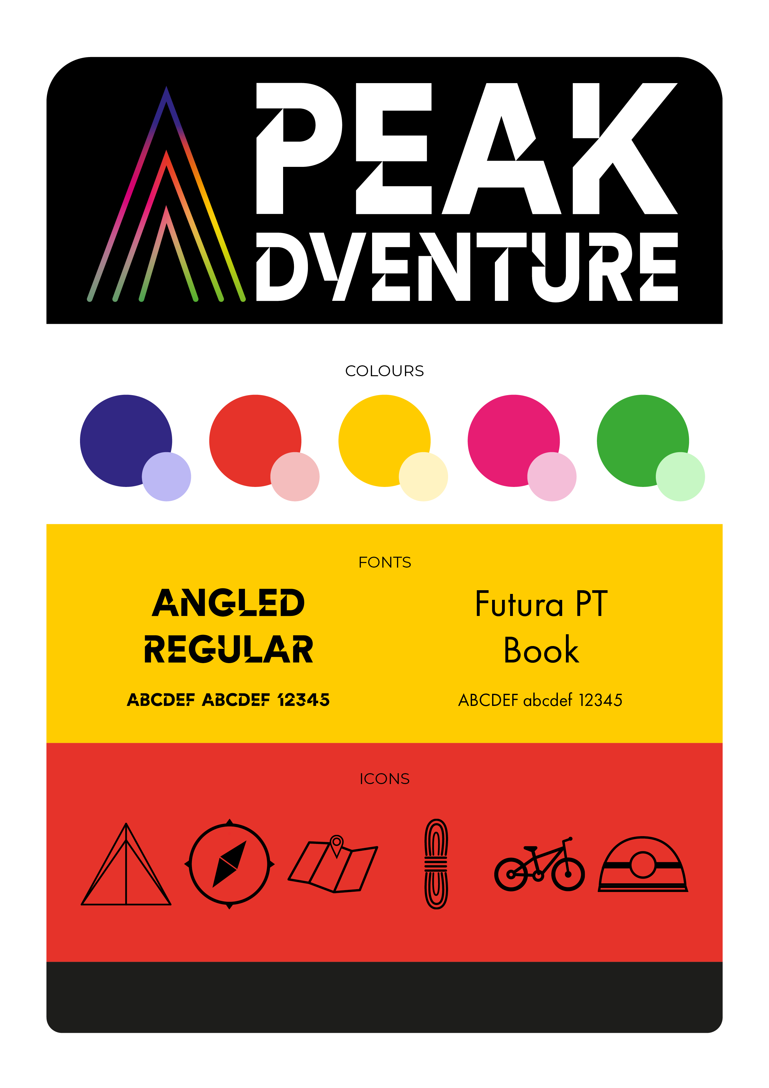
- Logo: Using the peak concept and the love that this company has to summit mountains and climb higher, I developed a trio mountain peak that was made up of gradient colours to represent the variety of activities undertaken. This was complemented by the use of an angled typeface, adding a strong, sharp focus.

- Colours: Bold, bright and loud was the brief, but I think this vibrant palette goes further. The subtle use of the full palette in the logo gradient provides opportunity to highlight colours on an individual basis, providing room for growth.

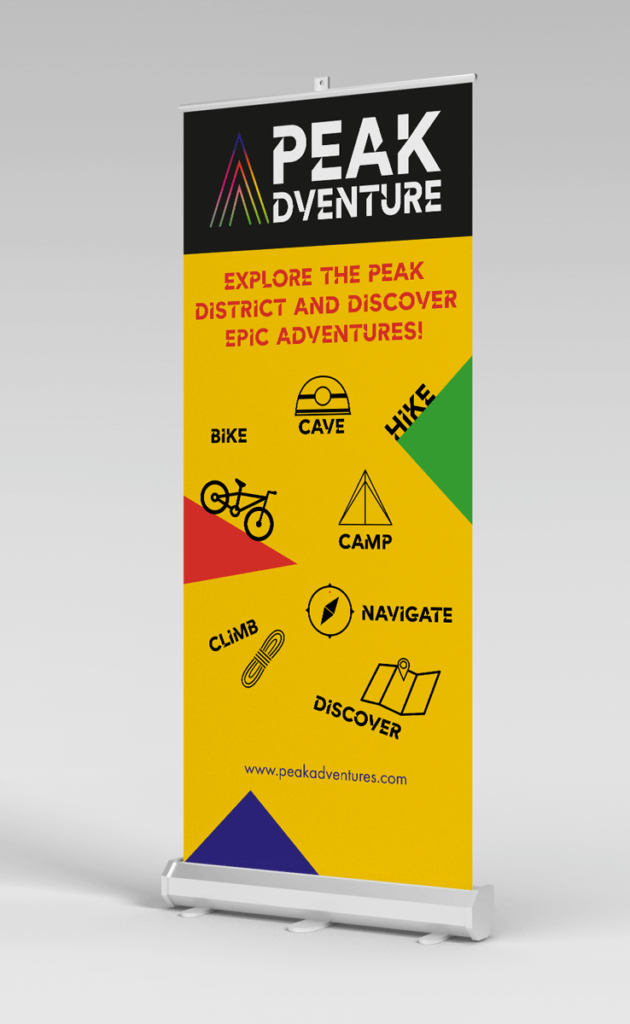
- Icons: This organisation wanted to complement their imagery with icons that represented activities they deliver. Using simple, single line icons that transfer well across different platforms and are easily recognisable and communicate their meaning was the main goal.

